The idea behind my business logo
Business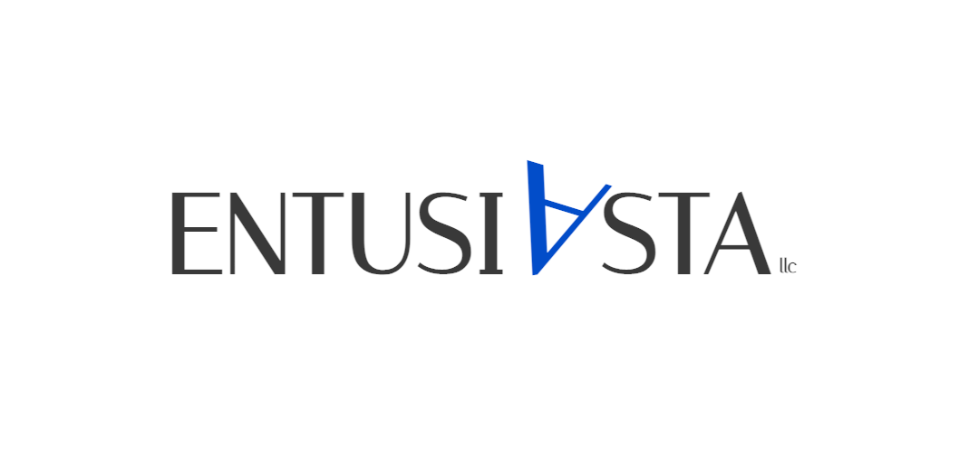
For those who may wonder, a year ago I decided to open my first IT company here in Armenia and in this article I’ve already shared my story.
Having no idea of what my company’s name was going to be, I just gave it a random name at the beginning. Certain time past, and in a moment of enthusiasm, I have decided to rename my business into Entusiasta (from Italian, Enthusiastic).
Today Entusiasta LLC is mainly involved in the development of frontend interface solutions in collaboration with its partners. Over the time, I started thinking about giving my business more character and for that I decided to create a logo that can fully represent it. The logo in general is one of those things that has always fascinated me, the idea to transfer a broader meaning through a few small characters attracts me.
Considering the same experience of some my colleagues, I challenged myself to create something interesting. The first thing I did was reflecting about those things my logo must express: Information technology and enthusiasm.
I have googled images related to enthusiasm, and I found things like this
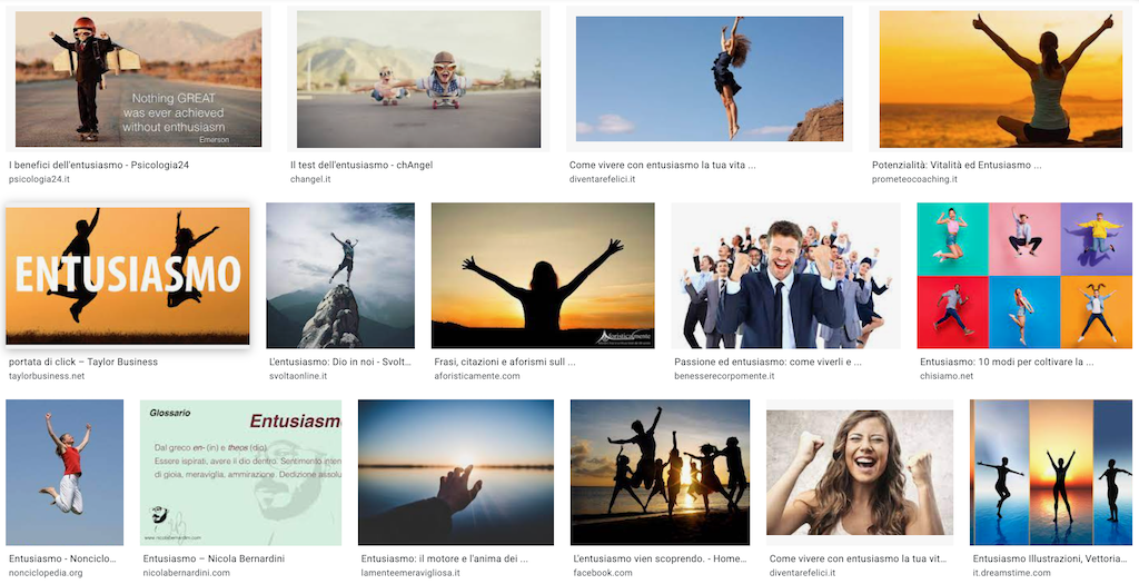
Looking at these images, I have noticed that the recurring aspect was the hands raised as a sign of joy, and from here I tried to reproduce this sign in my logo. Since I am not a lover of complex communication (I think the use of images should be limited. Am I an iconoclast??), I did not want a logo that is too colorful or complex. So I tried to achieve this by taking advantage of what I already had: the letters of the company name.
Thinking back to the name, I quickly noticed that the letter A in particular was the perfect candidate to symbolize this emotion. Look:
ENTUSIASTA
If I take the letter A and turn it upside down, it looks a lot like the gesture of raising your hands.
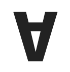
It's not true?
When I realized it, I said to myself: I'm already close to the solution!
Now I needed to choose which of the two A to rotate. And in this case the choices were obviously two. However, according to the rules of proportion and my desire to consider that obvious proportion that we all know, aware or not, the so-called golden proportion, the choice logically fell on the first A.
But after rotating the letter, it seemed to me that it was a little too static, so I decided to rotate it further, misaligning it from the remaining text (straight and symmetrical things are hideously authoritarian!), and to emphasize it I also enlarged it a little, making it pop out.
The second thing that remained for me to take care of was the connection with the technology, and for this purpose I decided to simply use the right colors, without adding further shapes. I have chosen dark gray and blue, which are known to be the colors that refer to technology in general. With a little pop of color and a little bit of CSS, this was the result.

The whole process took ten minutes. What else to add? I loved it right away, the tuning was immediate, I saved the result and looked at it for a long time, yeah, for a very long time.
I want to thank Gabriele Ionfrida, a highly professional designer who first showed me the creative process behind a logo, and thanks to which I understood from where to start.