
Scrolling effects for web pages with CSS transformation and javascript, a theoretical introduction
Web design Information technology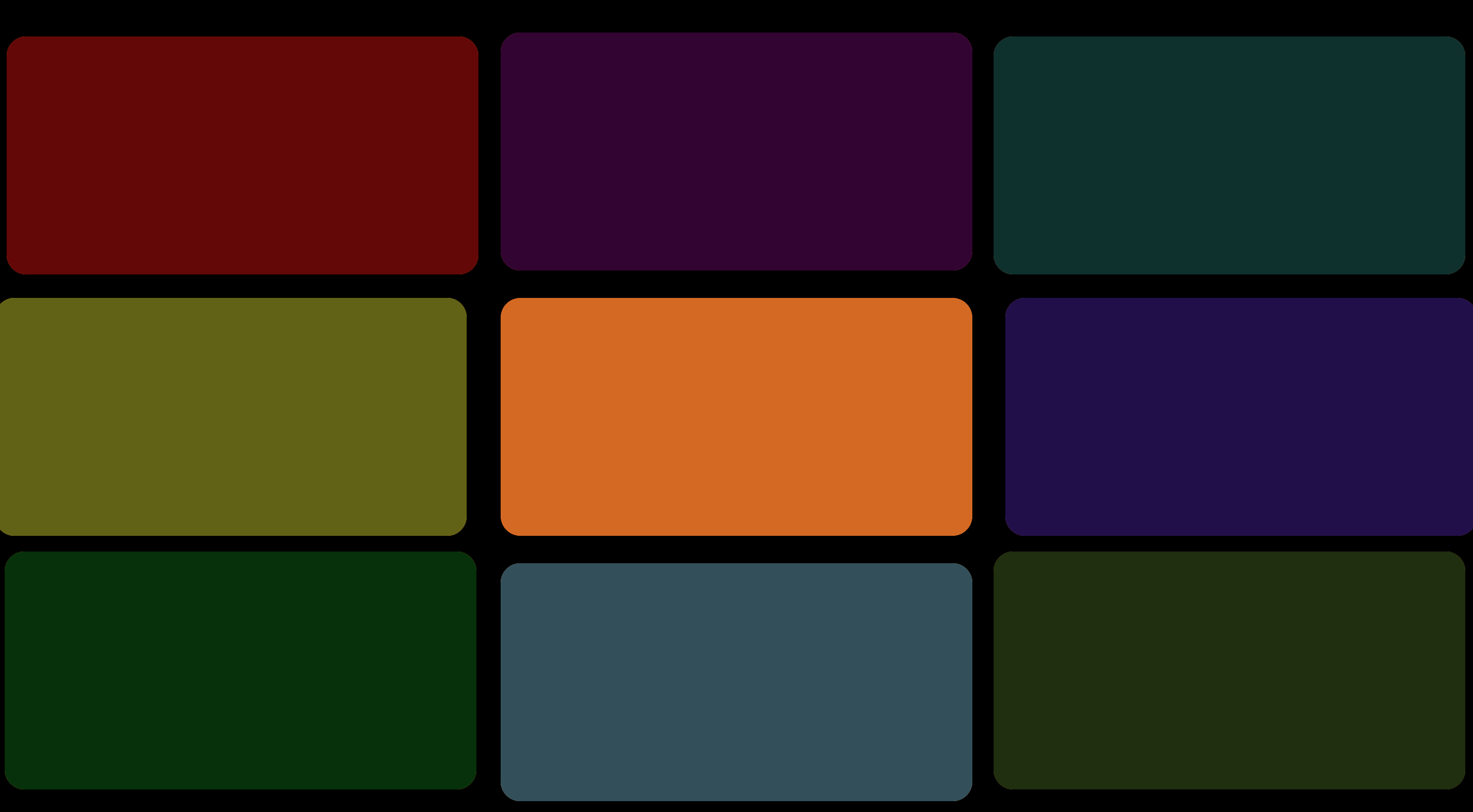
Modern web pages are often full of animations that make the content more interesting, as well as more pleasant and surprising, enticing the visitor to continue browsing. Many of these are developed using the modern tools provided by CSS 3 and a pinch of javascript. Developing them isn't difficult, but you need to be aware of some basic practices to get started right.
The process can be divided into 3 points:
- Develop the layout by considering arranging the elements in their final positions (no animation)
- Translates out of their final positions the elements to animate using the "transform" attribute
- When scrolling, calculate the return of these elements to their starting position. To do this we need to get some fundamental data.
Obtain the necessary data
As you may have noticed, the elements of the page move according to the scroll, this is a fundamental point that helps us understand how everything works. The scroll is the event that triggers the actions. So all the code we're going to write must be executed on every scroll.
document.addEventListener('scroll', function() { ... }
But how can animations be so well timed? Why do the elements adjust at the "right time"?
This is the question whose answer represents the second foundation of this development. In fact, the second thing to consider is a "reference point" in the page, which can be any HTML element. The distance between this reference point and the scroll level are usually the two fundamental variables. The closer the browser viewport is, the closer to its peak the animation will be.
So, let's start by getting a reference to the div that we will use as a reference point. It can be the element you want to animate or a div related to it.
// Reference point
referenceDiv = document.getElementById('div-to-animate');
Now, as we said earlier, we need to know how far this element is from the top edge of the viewport. To get this data we can use the getBoundingClientRect() method.
referenceDiv.getBoundingClientRect().top
Having this information, we already have something important. Now we can know how much to move our objects on the page. But to do that, we first need to calculate the ratio of the distance to the maximum threshold. The maximum threshold represents the distance in pixels below which the animation activates, and above which the animation is stopped. It answers the question: at what distance does the animation start?
maxThreshold = 600; // px
ratio = referenceDiv.getBoundingClientRect().top / maxThreshold;
Below I present some possible results of this calculation.
Distance to the reference point is 600, the result is 1 => (600 / 600)
Distance to the reference point is 300, the result is 0.5 => (300 / 600)
Distance to the reference point is 150, the result is 0.25 => (150 / 600)
Distance to the reference point is 0, the result is 0 => (0 / 600)
Now we can use this value to calculate how much to move our object. If we are careful enough we will make sure that the result is always a value between 0 and 1. The min / max method of the Math object can be useful for this purpose.
elDistanceFromTop = referenceDiv.getBoundingClientRect().top;

// The activation threshold is minimum 600px
minDistance = Math.min(maxThreshold, elDistanceFromTop)

// The lowest value (in this case) we want to be 0
ratio = Math.max(0, minDistance) / maxTreshold
We got the fundamental information, the ratio. Now we can calculate the amount of transformation of an element
ratio
↓
Simple case: regulate the opacity
Having the ratio calculated above, we can now get the amount of transformation.
Let's start with a simple case, changing the opacity. As we know opacity is a value ranging from 0 to 1, which is why we can use the ratio directly without further recalculations. Above we noticed that the closer we get to the element, the closer the ratio is to 0. Since we want to display the element gradually and not hide it, we should use this value to get closer to the maximum degree of opacity.
divToAnimate.style.opacity = 1 - ratio
If ratio is equal to 0.8 the degree of opacity will be 1 - 0.8 therefore 0.2. Similarly, if the ratio value will be 0.1 (distance is almost nil) the degree of opacity will be 1 - 0.1 therefore 0.9. The opacity will therefore be 1 when the ratio is 0, that is when the distance between the object and the top edge of the viewport is 0 (or less).
Transform an element
Now that we understand how to take advantage of the calculated ratio, we can carry out more complex transformations.
CSS3 provides some attributes that will surely come in handy if we want to spare ourselves a few lines of code. A famous case is the transform attribute.
A classic method is to position the elements as if they are not going to be animated, so exactly where we would like them to be placed.
Then, once we have completed our layout, we can change the starting position of these elements by adding the transform attribute. For example, we want a div to appear slightly below where it really is, so that it can return to its starting position as we get closer.
To do this, let's transform it.
#div-to-animate {
   ...
   transform: translateY(200px);
}
Now this element is translated below its real position.
Recall that the point 0,0 of the virtual Cartesian plane is the upper left corner. By giving a positive value to the translation on the Y axis we are telling the machine to move the element further down.
This way, having the object translated downwards, we can make it come back up as we get closer to it. We can use the ratio we calculated to obtain the amount of upward movement (remember that to calculate the ratio we need to have the distance of this object from the top edge of the viewport as we did earlier in the first chapter).
initialTranslation = 200;
quantityOfTranslation = Math.max(0, initialTranslation * ratio);
divToAnimate.style.transform = `translateY(${ quantityOfTranslation }px)`
Here we must be careful. Note that I have taken into account the initial value of the translation, in this way I can calculate the subsequent values starting from it.
By reusing the ratio we have calculated it is possible to transform the elements in different ways, for example by modifying both the translation on the X axis and on the Y axis, thus obtaining something similar to this.
In this example, the elements have been positioned in a very normal grid and then assigned a basic translation. As we get closer to the container of this grid (our reference point), I have used the relationship between the distances to obtain the value with which I recalculate the translations back to 0.
Please note that:
What is explained in this article is obviously not a set of fixed rules to be respected, but it helps us to understand the logic of the operations. Now that we know how to get started, we can break the rules and use numbers in any way that works best for us.